ShopDreamUp AI ArtDreamUp

AI art: background views
the default size is 512 to 1024, but all images are being resized.✅without deviantart_watermark+ upload verious size 2048/3072/4096+anything theme of view BG✅But please note that my initials are in it.
$8/month


Suggested Deviants


Suggested Collections


You Might Like…


Featured in Groups


Comments113
Join the community to add your comment. Already a deviant? Log In
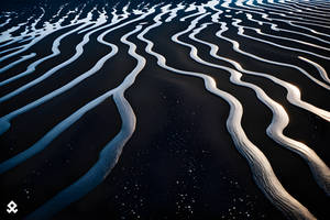
Quiet, peaceful, beautiful - that's what one could think about this photograph. It's essence lies in the simplicity, yet one would have to wait many days to witness a view like that.
The edge of the water here isn't a straight line - and it's good. Same goes for the coastline. The coast seems to end at some point in the background, yet the clouds are taking the eyes further, like in a relay race, where sky takes the baton from the land and runs uphill, passing by the sun.
The rocks in the foreground don't let the image fall to the "yet another casual coastline wallpaper" basket.
On the contrary, I'd have some minor reservations. The sun looks "dirty" - while this is quite normal when one "glues together" few images, it looks bad and requires minor adjustments to level the brightness - not only in the middle but also around, so the clouds won't look like they've met a lighted match. I'd also lower the blue colour spectrum. While it isn't an eyesore if one looks at the clouds right above the water, upper right corner of the image looks like it's been painted. And rocks like these here can have a livid, darker colour, but they shouldn't shine a blue light - and while it's subtle, comparing to the sky, it's showing, that without a doubt, that blue colour was "upped" too much.
My ratings:
Vision - I'd say it's above average, as it's better than many images "out there".
Originality - Same as above, mainly because of rocks and the layout of land and clouds.
Technique - You're almost there!
Impact - I'd say if I were to put that on a "Relaxing music" box cover, it would be perfect. But we're talking about "art" here, so I have to cut some from the max.
Summing up - it's the "final touch" that separates the "magnificent" from the "average" photos. And you, Sean, are already halfway there <img src="e.deviantart.net/emoticons/s/s…" width="15" height="15" alt="